(206) 258-6676

2024 Colors of the Year
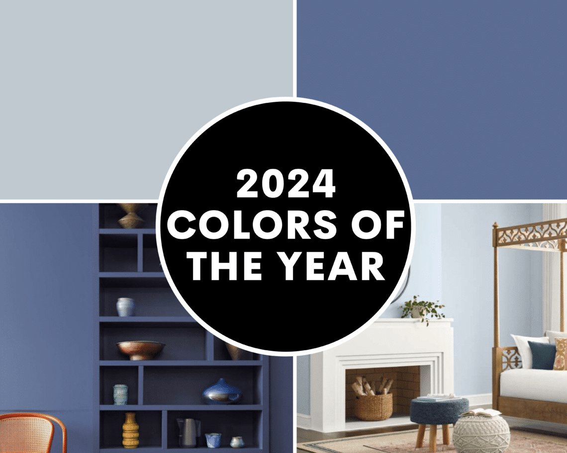
As we get closer to the new year, the interior design world is filled with excitement. We have all been eagerly anticipating the unveiling of the Colors of the Year by industry leaders Sherwin-Williams and Benjamin Moore, and they’re finally here! These paint colors are amazing, and we cannot wait to see them in action this year. These annual announcements set the tone for design trends, influencing everything from home decor to fashion. In this blog, we’re going to showcase the colors and some recommendations for incorporating them into your home.
Sherwin Williams
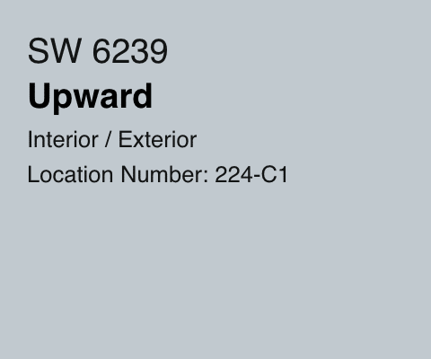
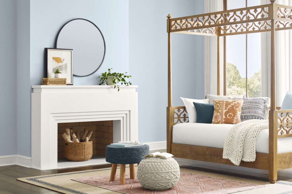
We are excited about the Sherwin Williams 2024 color of the year, Upward. This color is a nice shade of light blue. A calming color that looks like a clear sky, Upward provides an atmosphere of tranquility within any space. making it perfect for productivity and calmness. The subtle undertones of this color make it a versatile choice, suitable for a range of design styles, from modern and minimalist to classic and transitional. No matter the room, this color is going to brighten up your space. It provides a neutral backdrop and allows other elements in the space to be featured.
Sherwin Williams believes the lighter hue color trend will be big in the future. Sue Madden, the director of color marketing for Sherwin Williams, says “We knew lighter tones were going to be important in 2024 and 2025 and we wanted to forecast the shift from earthy neutrals to lighter expressions and a light blue like Upward SW 6239 told that story very well.”


Benjamin Moore
Benjamin Moore’s 2024 color of the year is more bold in our opinion. It is called Blue Nova, and looks beautiful! This color is a vibrant blend of blue and violet. It is a captivating shade that is reminiscent of the night sky, evoking a sense of wonder. Blue Nova’s depth makes it an adaptable color, capable of creating a bold statement or serving as a sophisticated backdrop. Blue Nova has the power to transform a space by becoming a strong focal point. Whether used in a bedroom, living room, or dining area, this intense blue hue infuses the room with a sense of opulence. Benjamin Moore’s color marketing director, Andrea Magno, describes the color as “an alluring mid-tone that balances depth and intrigue with classic appeal and reassurance.”


Recommendation
These two colors can be great options for certain areas in your house to paint. We recommend getting paint samples to apply the paint on the wall to see how it looks when it dries during different times of the day. The specific sheen you choose can affect the look of the paint as well. Check out this link to Sherwin Williams website to view all the options for sampling a color. Contact us if you have an upcoming painting project! Thanks for reading.
